The “best” dashboard is the one that yields actionable insights AND gets adopted by your end users. But what are the best practices to ensure your dashboards meet these criteria?
After years of meeting with customers and using their requirements to build dashboards, we have learned some valuable insights. In this blog we share 10 best practices so you too can build dashboards that are beautiful, impactful, insightful and – best of all – used in your organization.
Learn Tableau. Expert instructors. Advanced topics.

10 best practices for insightful, impactful Tableau dashboard design
- Design a dashboard with a goal in mind. Don’t throw all of your unrelated worksheets onto one dashboard and expect it to be a cohesive story. What are you trying to accomplish? Start at a high level, provide a summary and let your users drill down for further details. Overcrowding tends to be a big issue for many developers and can lead to frustration on the part of your user. When trying to determine if your dashboard is accomplishing your goals, use the five second rule: put your dashboard in front of your users. Within five seconds they should be able to ascertain what the dashboard is trying to accomplish.
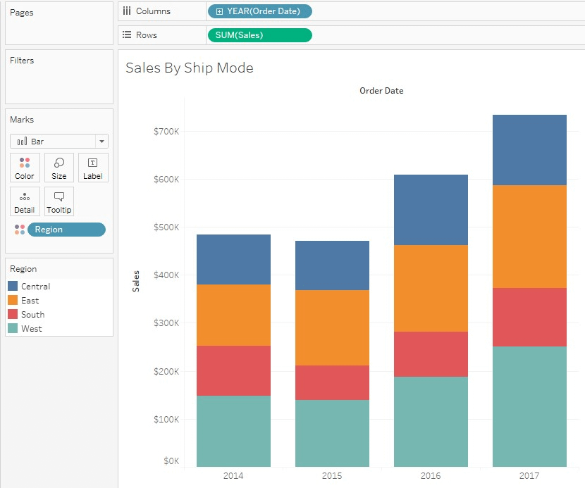
- Overall dashboard layout impacts effectiveness. Visual science tells us that the first place our eyes go is the top of a screen. Putting information there will create a good visual hierarchy that users can easily scan. The worksheet your users start with is often called the driver worksheet. Put this worksheet at the top and use it to filter detail worksheets below. To easily turn your top worksheet into a driver, click on the funnel icon in the top right corner. This creates a dashboard action Use as Filter. When Use as Filter is activated, clicking on something in the top worksheet filters the information on the other worksheets.
Below is an example of a dashboard with a summary at the top which is used to filter the details below (Sample Superstore Data).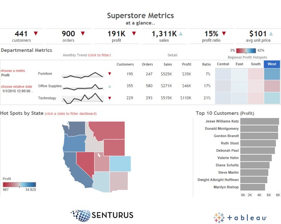
- Design for performance. Start with summaries that provifde options to drill to detail. Do this in lieu of putting all of your detailed data on your initial worksheet. Remember, the more marks on your viz, the more work Tableau has to do to render the view. Only drill to the lowest level of detail when users want to narrow their focus, for example, a particular product, year or category. In addition, if performance is an issue, use extracts to keep a static local copy of the data. Alternately, have your data source in something that can be tuned for performance, like a database with indexes rather than in an Excel spreadsheet. Note: If you need help with tuning dashboard performance or creating a data repository, contact us for a free one hour consultation!
- Use the chart type that works best for your specific goals. Don’t just duplicate your Excel worksheet in Tableau. Vizzes should be visual, not just a bunch of numbers on a screen. Whenever possible use:
- Bar charts to compare numbers
- Stacked bars for categorical comparisons
- Line charts to depict trends over time
- Scatter plots to easily see outliers
- Maps to depict data geographically
- Show me to experiment with different vizzes
Note: For additional tips on what chart type to use, read our whitepaper: Which Chart or Bar Graph is Right for You?
- Know the color types in Tableau and how they are used. When you drag a dimension, measure or calculated field to color, Tableau looks at what you are dragging and the values in your data. It then determines how color will be applied. When determining color, Tableau uses the following color types:
- Gradient color is used to show scale. For example, if you drag Sales to color, Tableau looks at the lowest sales and the highest sales and assigns gradient color (i.e. the higher the sales the darker the color).

- Divergent color is often used to show profit. For example, red or orange could be used to imply “bad,” green or blue could be used for “good.”

- Categorical colors divide things by color based on something like a category, region or year. This feature is often used in stacked bars to break down values in a bar.

Also, when choosing a color palette, make sure to maintain consistency within your workbook and within your data. For example, “Central” is always blue, “East” is always orange, etc.
Note: The above chart shows the default behavior for color in Tableau. If the default colors do not meet your needs, you can change them by clicking on color in the marks card and selecting edit color.
Watch video: Dazzling Tableau Dashboards
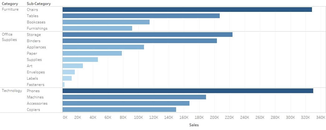
- Maximize actionable insights by minimizing dashboard objects. In other words, don’t have three or more worksheets on a dashboard when you can clearly convey the information in one. For example, if you want to display sales by category, sub-category and location, don’t put each on a separate bar chart on one dashboard, this can be confusing for your users. Instead, try depicting the different dimensions (i.e. category, sub-category and location) on one worksheet using color, size and shape to differentiate them. And if it makes sense, put your dimensions in a hierarchy (i.e. category, sub-category) so your users can easily drill from one level to the next by clicking on a “+” sign. Designing your dashboards in this manner will give a complete picture without putting your users into information overload. And, since fewer queries are involved in rendering your dashboard, its performance is better.
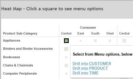
- Know Tableau’s three basic types of navigation and how to use them correctly. Tableau has three different types of navigation: select, hover and menu. These can be used to walk your users through your data or give them additional information. An example of select navigation is a dashboard action that makes bars in a bar chart clickable. When users click on a bar, a select dashboard action fires, which drills down to a detail worksheet, showing only relevant detail data. Hover navigation works similarly except it fires when you hover over an item. (Note: use hover conservatively; it can be confusing if overused). Menu options are used to navigate a user to an entirely different worksheet or dashboard. See below for an example of a menu dashboard action used in a heatmap that gives users a choice of which worksheet to navigate to next.
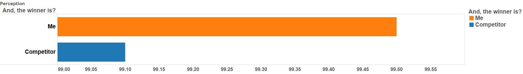
- Be aware of perceptions when designing dashboards. When using something like bar charts to compare numbers, try not to distort reality. For example, when comparing two bars, the numbers on the axis can be used to give the perception there is a large difference, whereas in reality the difference is minimal. In this example, the beginning and ending values on the axis are used to give the perception that the difference is much greater than it is.
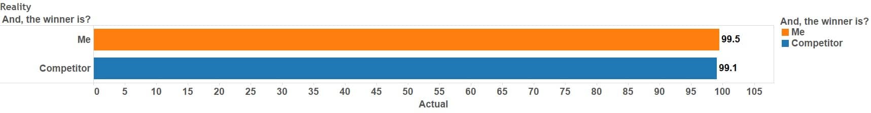
In this example, the axis starts at zero, which is a much more accurate depiction of the difference.
Watch video: Tableau Dashboard Design Best Practices
- When using color in Tableau, use it to emphasize a point, not to overwhelm users. Sometimes less is more. In his book, The Visual Display of Quantitative Information, Edward Tufte introduced the concept of the “data-to-ink ratio.” He said, “a large share of ink on a graphic should present data-information.”* Granted, things have changed since that was written in 1983 and in today’s world information is shared digitally versus printed. But it is still important not to visually overwhelm users. So if ink (aka “color”) is needed to make a point or to emphasize a difference, that is fine. Just be careful not to overuse it so users cannot focus on what is important.
Spotlighting is a good example of how to emphasize what is important without overwhelming your users with color. With spotlighting only numbers that meet a defined threshold are highlighted.
Below is an example of how to do spotlighting using Tableau’s Sample Superstore dataset:
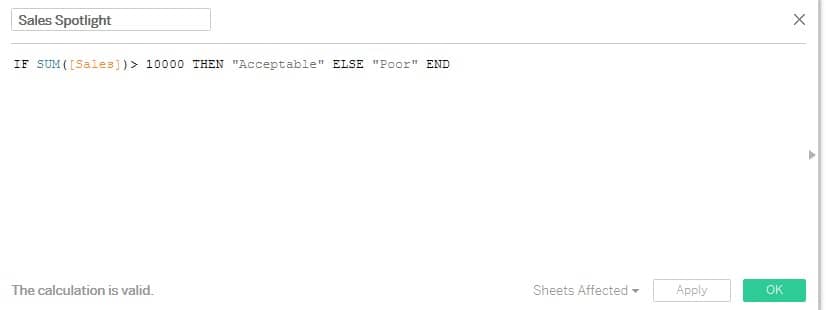
- Create Calculated Field. Name the field “Sales Spotlight” Click OK.

- Add Segment to the Columns shelf. On the Rows shelf add both Category and to its right, Subcategory.
- For your measure, drop Sales onto the Text box in the Marks card.
- Lastly, to provide the desired highlighting, drag your newly created Sales Spotlight on color.
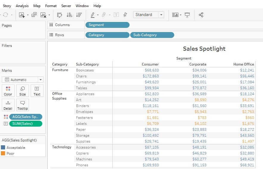
Your worksheet should look as follows (notice all sales below $10,000 are highlighted differently).
Note: Read the paper Stephen Few (a great resource when it comes to dashboard design) wrote on color/data-ink ratio.
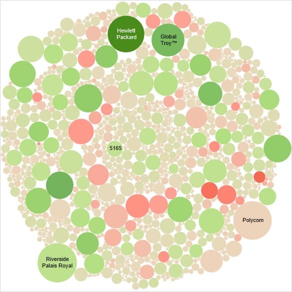
- Make sure your visualization allows users to accurately compare values. If packed bubbles or a word chart make it difficult to accurately compare values, consider a scatter plot or a map to show data in a way that makes it easy to compare values.
In the worksheet below, packed bubbles are used to display sales by product. This way of visualizing data has an undesirable data-to-ink ratio. It is really hard to accurately compare the sales of the different products.
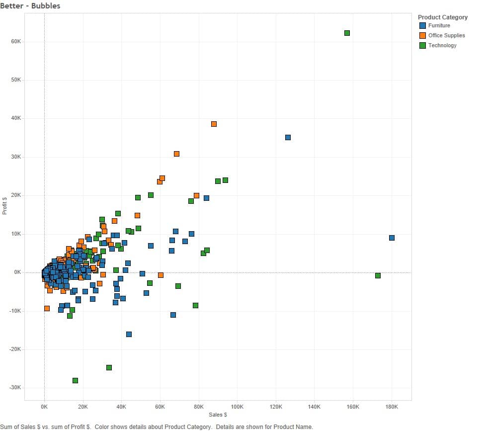
The viz below displays the same information in a scatter plot. Note how much easier it is to identify outliers in this visualization. In addition, further details like product category can be put on color to convey more information.
To sum it all up, Tableau dashboard creation is part art and part science. Use both sides of your brain when creating your dashboards. Vizzes are about more than simply presenting the numbers in your reports; they are about effective use of graphical elements to enable insights and aha moments for your users. Adhering to these dashboard guidelines will help you design for beauty, impact and insight. Remember, the “best” dashboard is one that is used.
Get a Tableau All-Access eLearning pass. Visualization best practices included.
At Senturus, our Tableau consulting services help clients successfully transition to a nimble, large-scale application of Tableau that allows them to securely share data. We offer extensive array of Tableau training courses—both self-paced and instructor led to take you across the finish line and maximize your ROI.
Learn Tableau. Expert instructors. Individual & corporate training.
*The Visual Display of Quantitative Information, Edward R. Tufte, Graphics Press, Cheshire CT, 1983, p.93